Colors make our lives beautiful; everything you see in our world, natural or man-made, has color. We observe it as a pigment (chemistry) or light (physics), but in this blog, we will talk about the personality of colors (psychology), and how you can use it for your home.
When I was earning my degree in Interior Design, we had a course called Color Theory. Color psychology is one of the things we discussed wherein we studied the subliminal effects of color in relation to our environment.
In color psychology, I learned that every color has its own personality traits which can impact not only the visual look and feel of a room or space but our moods entirely. By triggering our emotions, colors have a way of influencing our decisions, which is why it is always used as a persuasive tool in marketing.
If you know the color psychology, you’ll be able to use it to your advantage in a lot of aspect in your life.
This post contains affiliate links for your convenience.
For more information, see my disclosures here.
For instance, in your home, you can use only the colors that speak to you – those that attract and calm you. This will create a home that really represents your lifestyle and what you or your family is about.
We have our personal favorites, and our color preferences change throughout our lives, but very few people understand why. It could be circumstances, like how we are attracted to dark colors when we are depressed, or light colors when we are happy. When we are attracted to a new color, we could be experiencing some outlook changes in our lives, or it may signify personal growth.
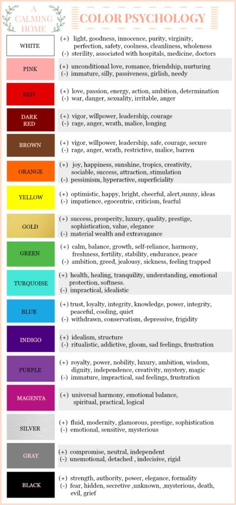
I made an infographic on color psychology so you can see the personality traits of some basic colors. It may give you an idea on why you consciously or secretly prefer one over the other.
But how do you identify YOUR color? What is the color that best represents you? Is it as easy as asking “what is your favorite color?”? Before you get confused, what’s important here is that you know what color soothes your soul.
What colors stand out in your wardrobe?
This is by far the easiest way to tell if you have a preference in color. For example, when I open my closet, I see a lot of light pink and blue, as well as other neutral colors like cream, white, black and gray.
What colors do you choose when you are left with a few options?
When you are shopping and you buy something that only has 3 or 4 colors to choose from, what color/s do you usually pick up? What is an “ok” color to you, and what is your “I love it!” color.
Still don’t know what colors to use in which room?
There are no hard fast rules on how to use color psychology in our home, but if you are totally clueless, here’s a general rule of thumb you might want to look into:
LIVING ROOM, FOYER, HALLS
In the Foyer, it would be in good taste to slowly transition the outside color of your house to the inside. Experts suggest that during winter, it would be nice to use warm colors for your living room, like reds, oranges, and yellows.
You may also choose earthy colors like brown or beige or greige ; it makes a room feel more cozy and intimate and encourages warm conversations. This is also a good idea when staging a home for selling during the colder months.
Do the opposite in the summer, where cooler colors such as your blues and greens, would make your home look clean, fresh and cool. For halls, I like to keep it neutral so I can draw the guests’ eyes to other rooms of the house.
KITCHEN
Experts suggest recreating the colors of your childhood kitchen to recall fond memories. When I was a kid, our kitchen had this nasty hue of green-colored tiles which matched the green tiles of the toilet next to it. I could barely reach the bar stools then and yet I distinctly remember saying it looked like poop color. Uhm, no thank you.
Experts also suggest using red to stimulate the appetite (as countless of restaurants and food companies do), but know that this color also increases our blood pressure and heart rate and stimulates activity.
Do we really want a busy, hurried kitchen?
We are not restaurants! 🙂
I find the color too uptight and “angry” for our ideal calming home. I would honestly think it would be bad for digestion too (not to mention for people who are dieting ^_^).
I would suggest using yellow or a light orange instead. If you have to insist on red, I think it would be good to only use it as an accent color on one wall, or just have your kitchen accessories in that color.
As for me, I believe that a white kitchen, regardless of shade, is still the best. It is a classic and marketable color; it makes a space feel spacious and gives it positive vibes.
DINING ROOM
Again, red stimulates the appetite and encourages communication, but you know how I feel about this color. Too much red may also encourage heated conversations, and we don’t want that while we are eating. I would suggest a creamy yellow or a deeper shade of orange. If you are feeling adventurous, I’ve seen beautiful dining rooms in salmon pink, peach, plum, and navy blue.
BEDROOM
The bedroom should be the most relaxing place in the house; this is where you relax, sleep, and lovingly bond with your partner. Create an atmosphere where you can do all these by using soothing colors like blues, greens, soft pinks and lavenders.
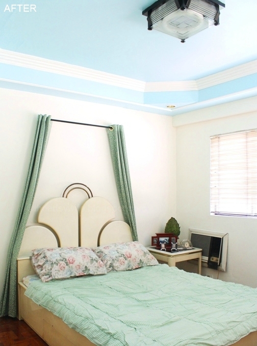
Don’t forget that your ceiling is your 5th wall (with the floor being your 6th), so you can also paint that to create the effect that you want, as I did with our master bedroom here.
BATHROOM
Ideally, we want the bathroom to look clean and relaxing. Blues and greens or your combinations of these colors (aqua, teal, turquoise, mint, sea foam, etc.) would be perfect in turning it into a private retreat. If you want to recreate the look a luxurious spa, these colors would look lovely when combined with whites (in all shades) and warm or neutral colors (beige, tan, gray, brown, black).
It is in the bathroom that we feel most vulnerable; we see all our physical flaws. That’s why when you can, consider choosing a color that flatters your skin color the most so you’ll get a boost of confidence when you look in the mirror.
GYM
Red could be a good color for this room to intensify your workout, but again, this color just scares me. I think it’s ok to paint a red wall in front of your workout equipment just to get you in the zone. But after a workout, cool, refreshing colors like blues and greens may be a better choice. Choose a happier, playful hue like apple or lime green, aqua blue or turquoise.
OFFICE
Color psychology is often used in marketing, but it is also often used in workplace interiors. Most offices set in the professional setting use the color blue because it promotes a sense of trust, and encourages communication and efficiency. Some offices, especially when they are in the creative industry, use brighter and happier colors like yellow, orange, and green.
Orange and yellow stimulates and energizes, yet too much can lead to angry confrontations. This is why it is popular to use them in combination with gray, a neutral color, to offset their negative effects. Green is also a popular choice because it reduces eye strain when you are looking at the computer screen for long periods of time. It reduces anxiety and promotes harmony and balance in the workplace.
I hope you have a clearer picture now on how color psychology works, how it affects us and how you could use it to create a soothing environment for your home. Let me know if you liked this post so I can make more like it!

